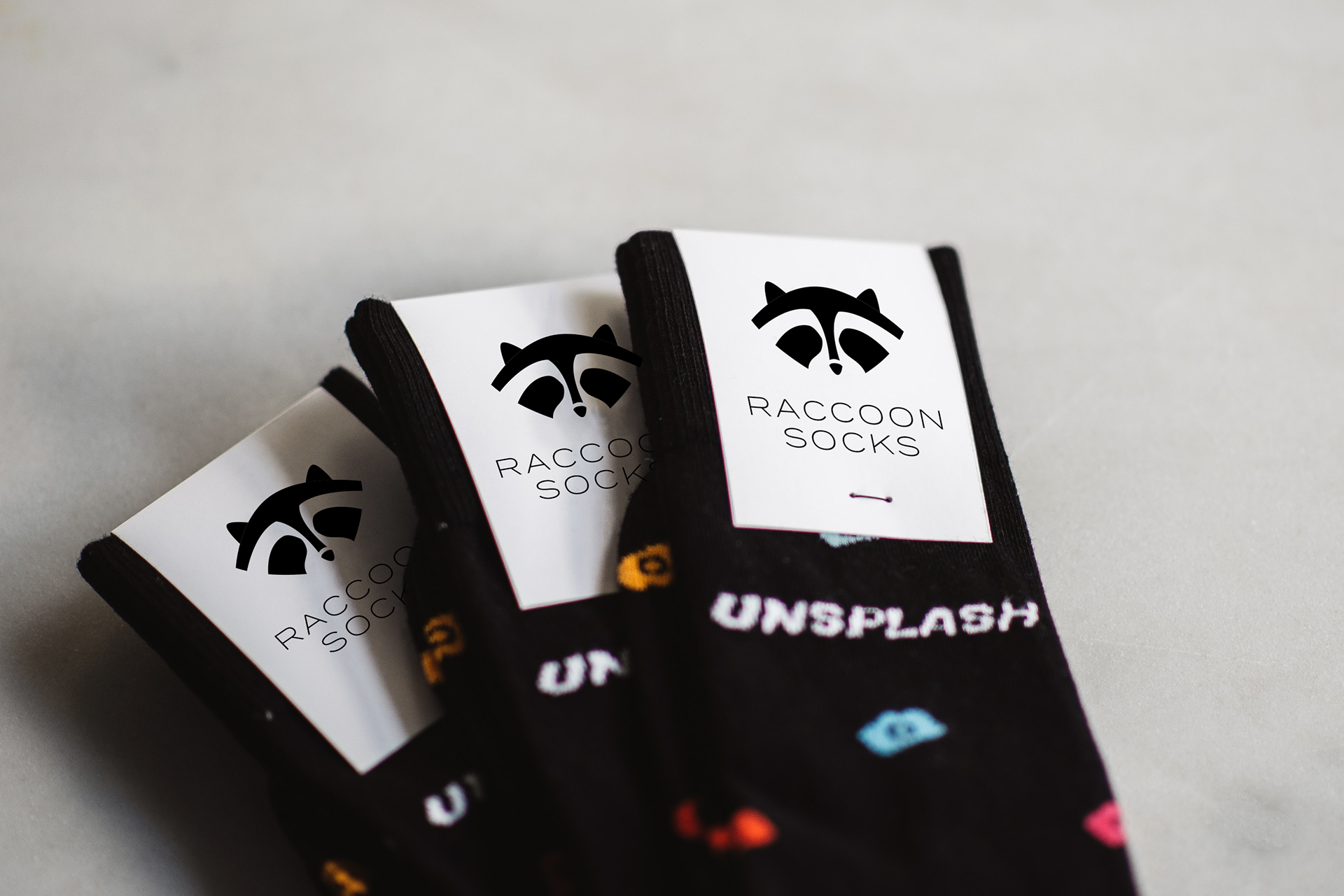
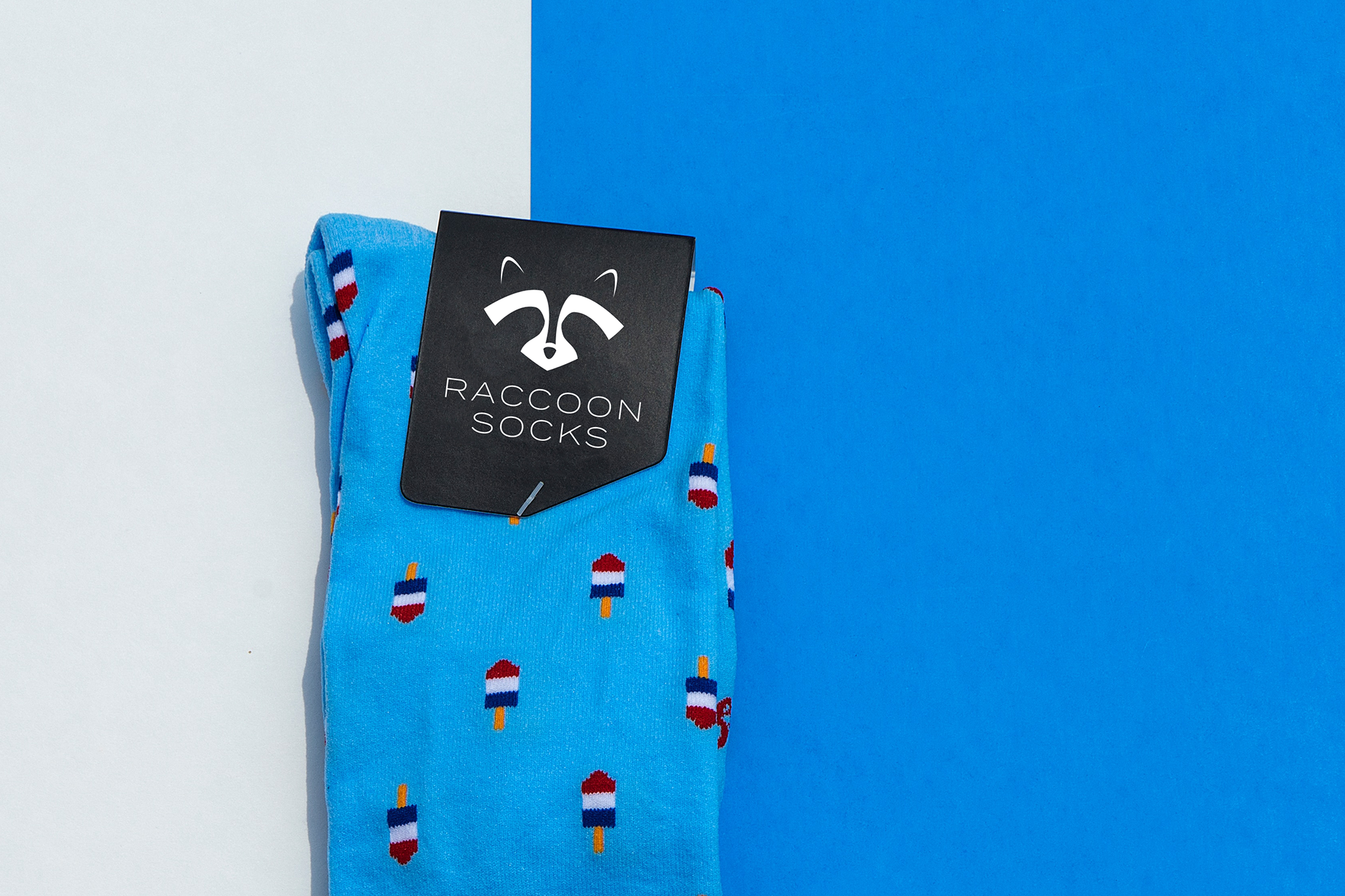
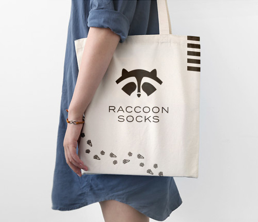
Final Logo
Initial Logo
I knew I wanted my logo to incorporate a raccoon. My first variation tried to use the raccoon's whole body, but wasn't clean enough and ended up being too complicated to use at small sizes.
Revised Logo
My revised sketches focused on the raccoon's face. I tried to create a logo that could be seen at small sizes and was easily reversible on dark and light backgrounds. As my vision for the brand evolved, I wanted a cleaner, more modern look. To achieve this goal, I simplified the logo a lot.
Packaging & Merchandise


Advertisements
